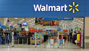
After nearly two decades, Walmart has unveiled a fresh take on its logo, marking a significant evolution since the introduction of the iconic yellow spark in 2008. This change symbolizes more than just a modernized appearance; it represents Walmart’s transformation into a cutting-edge retail and e-commerce powerhouse.
The New Look: A Blend of Tradition and Modernity
The updated Walmart logo features a deeper blue hue, thicker font lettering, and a more pronounced yellow spark. This design pays homage to Walmart’s roots, drawing inspiration from founder Sam Walton’s iconic trucker hat, while embracing the demands of a digitally-driven retail landscape.
The revamped bolder and blockier font conveys strength and reliability, while the richer colors project a vibrant and future-forward brand identity. Walmart’s Chief Marketing Officer, William White, explained, “The Walmart of today is very different than the Walmart of 2008,” emphasizing the retailer’s shift to modernize its image while keeping its core values intact.
Mixed Reactions From Customers
Despite the thoughtful redesign, consumer reactions have been mixed. On social media, some users poked fun at the subtlety of the changes, questioning whether the update was even necessary. Reactions ranged from mild confusion to outright humor, with others failing to notice the differences at all.
However, Walmart’s leadership remains confident. According to White, the updated logo reflects the company’s current trajectory and solidifies its position as a leader in both physical and online retail spaces.
The Rollout: Where to Spot the New Walmart Logo
The first rollout of the new logo occurred in October 2024 at a store in Springdale, Arkansas. By January 2025, customers can expect to see the refreshed branding across stores, the Walmart app, and its website. Full adoption of the new design is expected in the coming years as the company gradually implements the changes globally.
What Does This Redesign Mean for Walmart?
This logo redesign is more than a visual update; it’s a statement about Walmart’s growth and forward-thinking strategy. By blending elements of its heritage with a modern aesthetic, Walmart aims to connect with its loyal customers while appealing to a new generation of shoppers.
In conclusion, while the Walmart logo redesign has sparked debates and humor online, it’s clear that the company is dedicated to keeping pace with a rapidly changing retail landscape. This subtle yet significant update positions Walmart as a brand rooted in tradition but looking confidently towards the future.
Share via:


